My HNG12 Journey: Designing for Mental Well-being with Sonder
Getting Started with HNG12
Joining HNG12 is an exciting step in my design journey. As someone passionate about creating user-friendly and aesthetically pleasing digital experiences, I saw this internship as the perfect opportunity to challenge myself, grow, and contribute to meaningful projects.
The first task? Designing two screens for Sonder, a fictional wellness app that helps users build positive daily habits for mental well-being. This task isn’t just about aesthetics—it’s about understanding user needs and ensuring a seamless, engaging experience.
Understanding Sonder: A Minimalist Wellness App
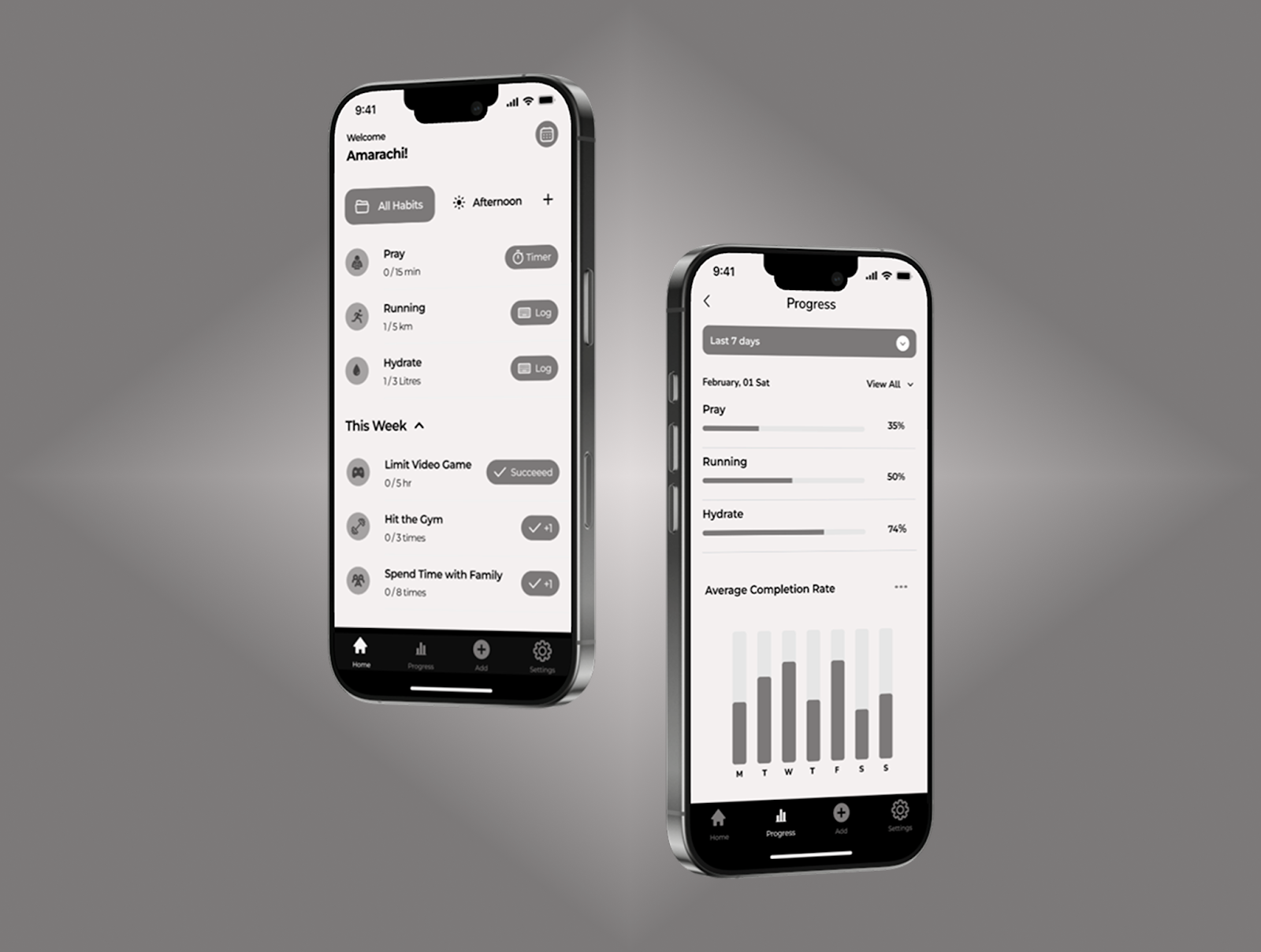
Sonder is designed to encourage users to develop and track positive habits daily. The app helps users stay consistent by providing a simple yet powerful habit tracker. My goal for this design was to create a clean, user-friendly, and distraction-free experience using an achromatic color palette (shades of black, white, and gray).
The two screens I designed:
Home Page – The main hub where users interact with their daily habits.
Habit Tracker – A detailed view of progress, including streaks and completion history.
My Design Process
1. Research & Inspiration
Before jumping into Figma, I explored minimalist wellness apps by going back and forth with Pinterest, Mobbin and Behance for better understanding to know what makes them effective. I used the Montserrat font as i find it to be very userfriendly.
2. Wireframing & Layout
My main goal was to ensure a clear navigation flow while keeping the interface simple and uncluttered.
3. Designing in Figma
I applied an achromatic color scheme, focusing on contrast and readability. I used subtle grayscale variations to create depth while maintaining a minimalist aesthetic.
4. Refinement & Testing
I fine-tuned typography, spacing, and button placements to ensure a smooth experience. Every design decision was intentional—maximizing clarity while keeping the interface visually appealing.
Here are the final designs
What I Learned
The Power of Simplicity – Less is more. A minimalist approach keeps the focus on user experience.
Color Constraints Can Spark Creativity – Working within an achromatic palette helped me think outside the box to create depth and contrast without relying on color.
User-Centered Design is Key – Every decision, from typography to spacing, impacts usability.
Goals for HNG12 & How I Plan to Achieve Them
HNG12 is a fast-paced, high-learning internship, and my goals are clear:
✅ Improve My Design Skills – By pushing myself with each task and gathering feedback.
✅ Master Design Tools – Enhancing my Figma skills and exploring new plugins.
✅ Build a Strong Portfolio – Completing real-world projects to showcase my abilities.
✅ Network & Learn – Engaging with fellow designers and mentors in the HNG12 community.
HNG Hire: Connecting Businesses with Top Designers
If you're looking for talented UI/UX designers, HNG has an incredible pool of creatives ready to bring ideas to life. Find skilled Figma designers, web designers, and creative experts here:
➡️ https://hng.tech/hire/figma-designers
Final Thoughts
This first task was both challenging and exciting. Designing for Sonder allowed me to focus on minimalism, usability, and user-centered design. As I continue through HNG12, I look forward to refining my skills and creating even more impactful designs.
Stay tuned for more updates on my journey! 🚀
Comments
Post a Comment